Perto Education
What we did
- Naming
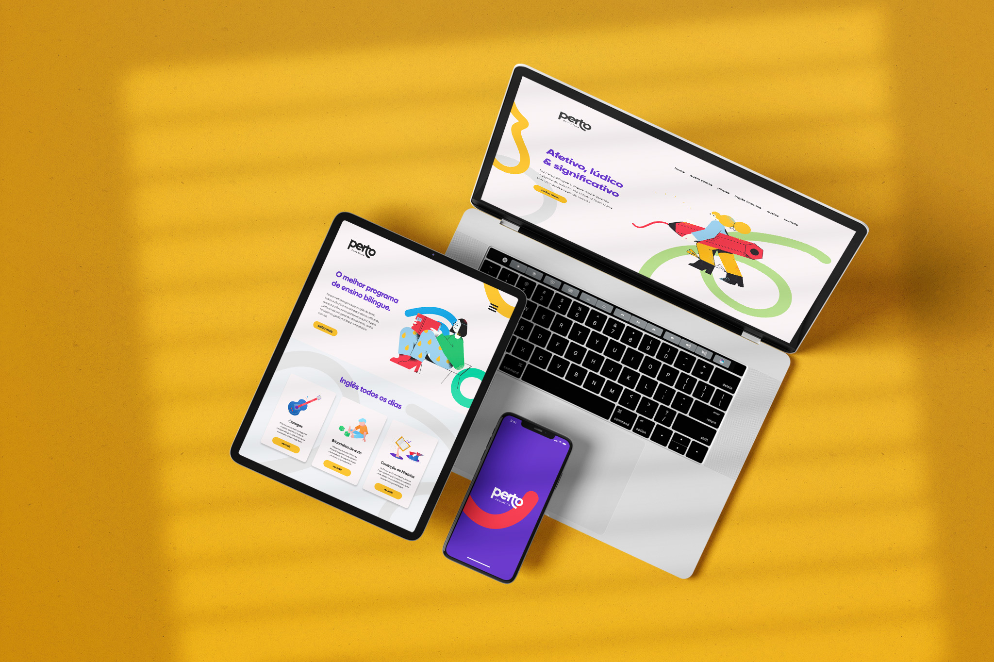
- Visual Identity
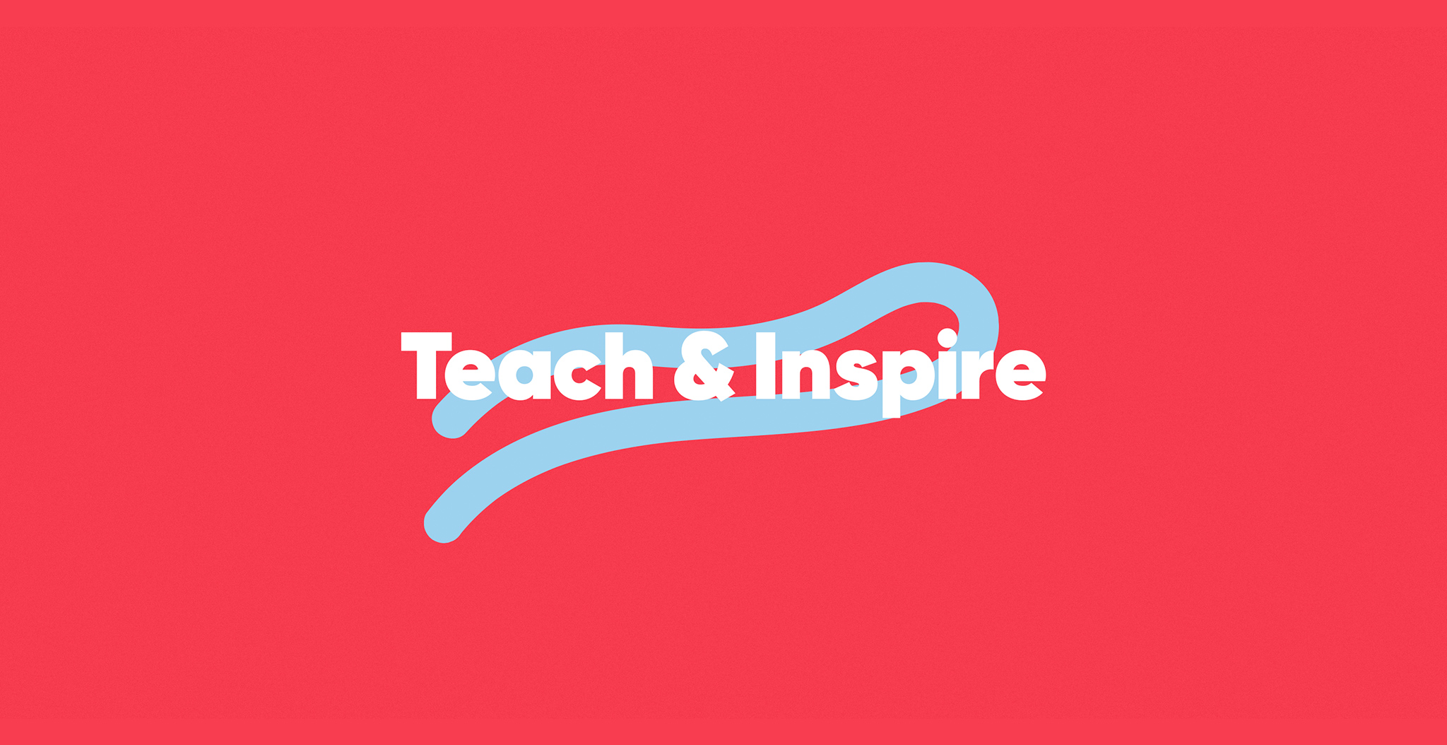
- Marketing positioning
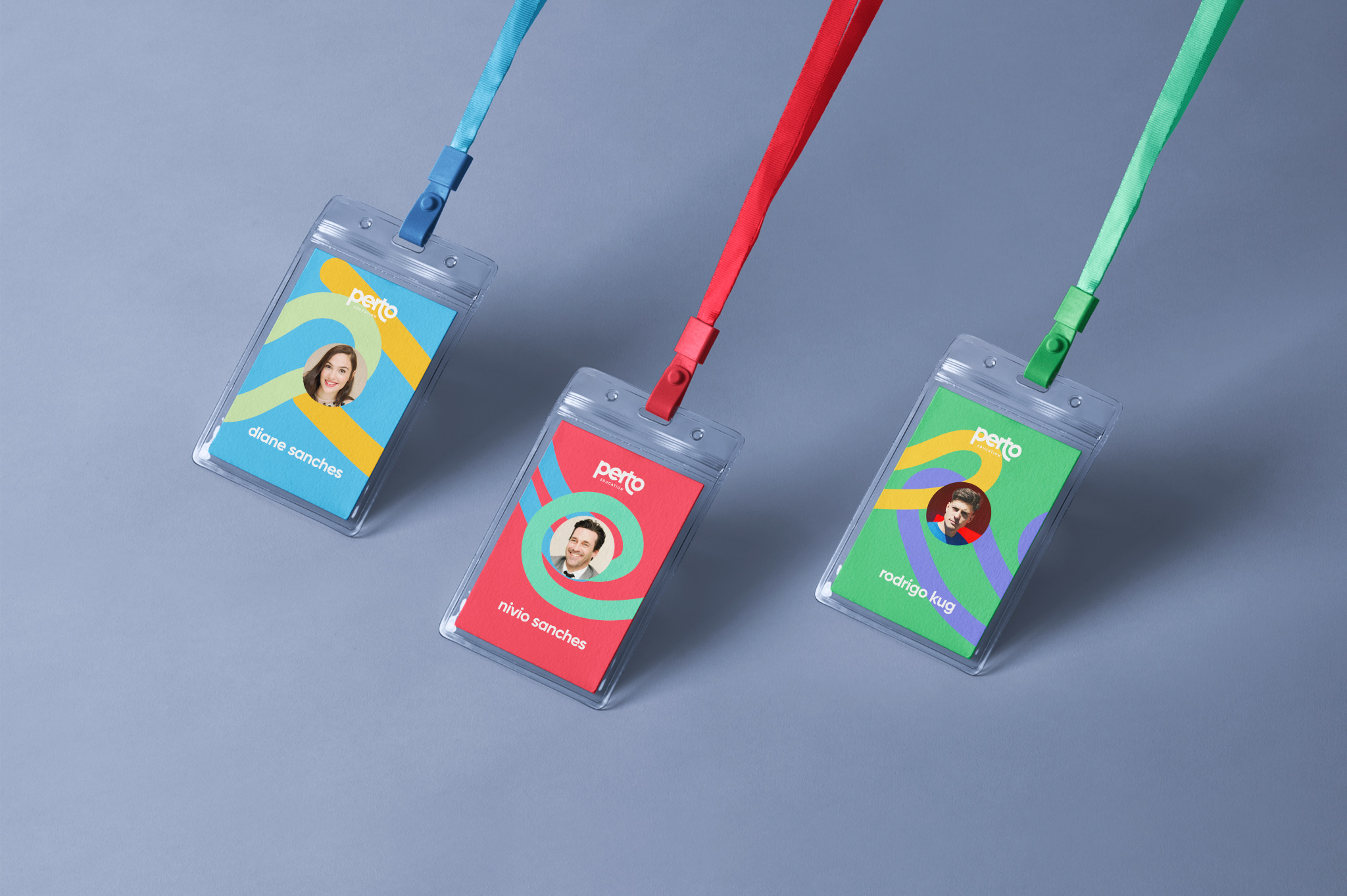
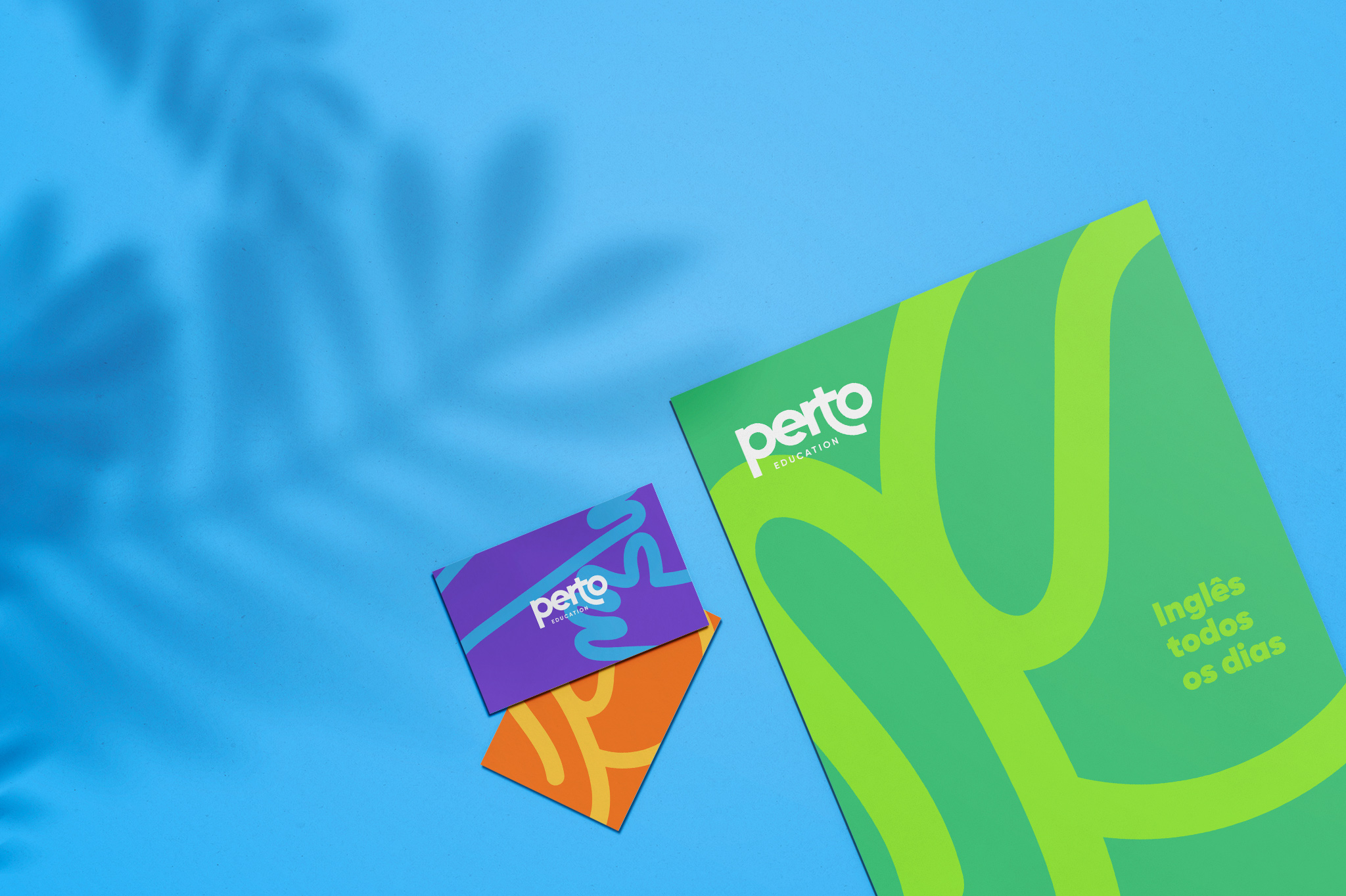
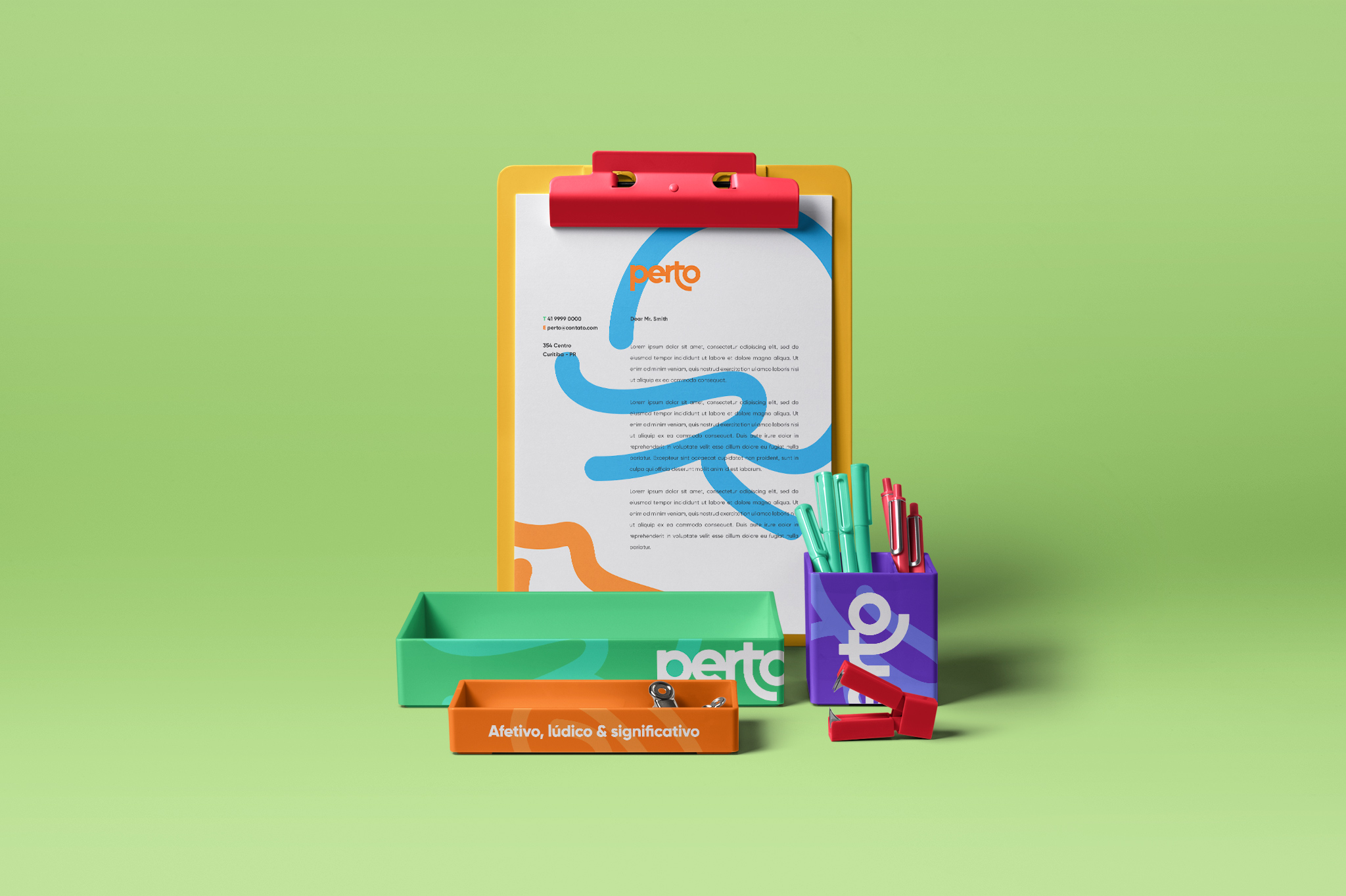
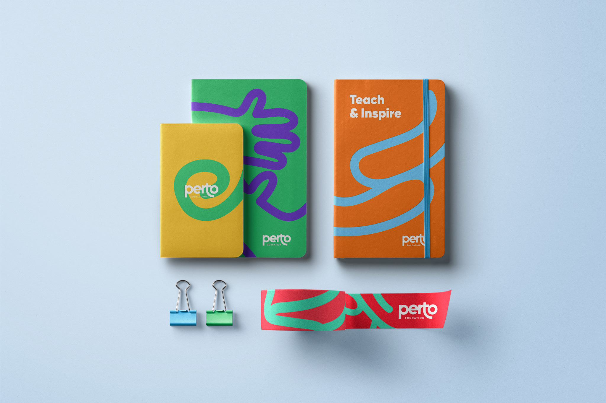
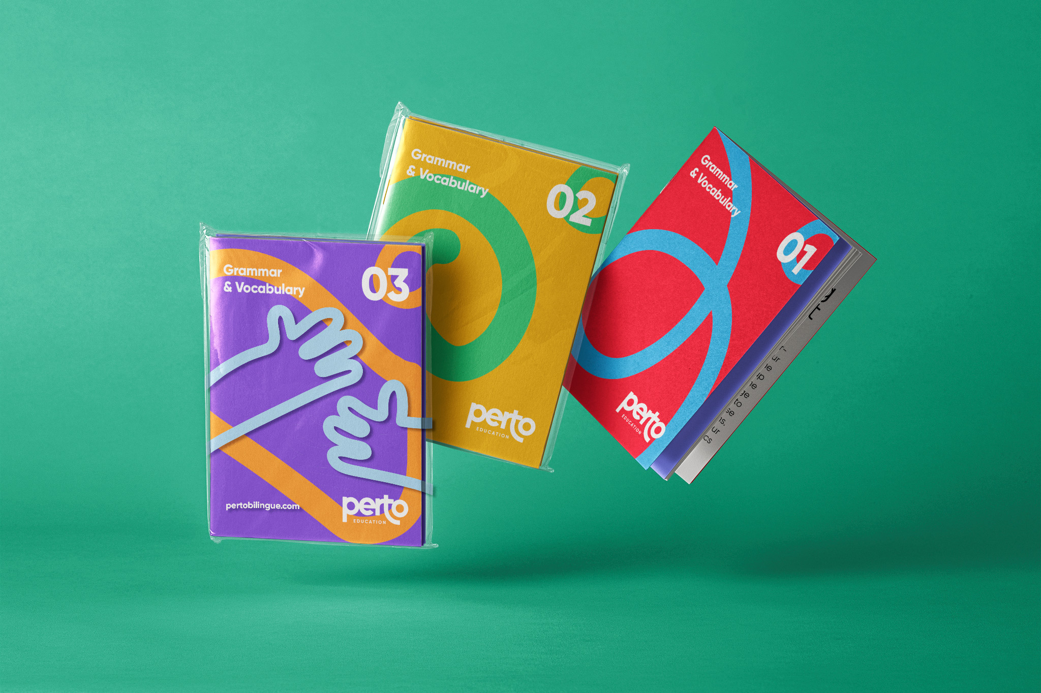
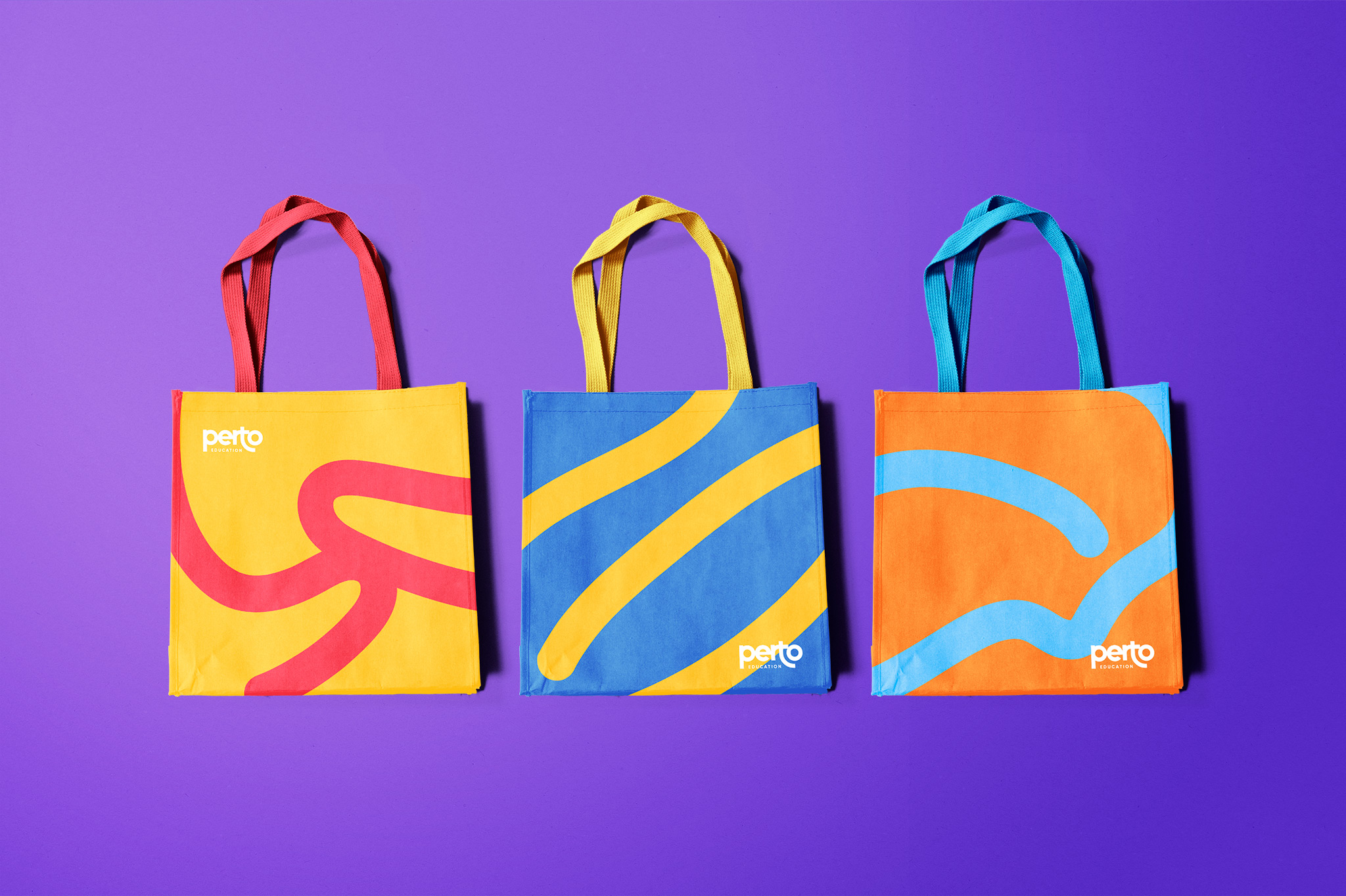
- Stationery design
Company Balloon Bilingue contacted us to realize a refresh of both their branding and naming. Although the bilingual methodology is their primary service at the moment, they were searching for a brand that would better represent them as a company that develops creative solutions for Brazil's education.
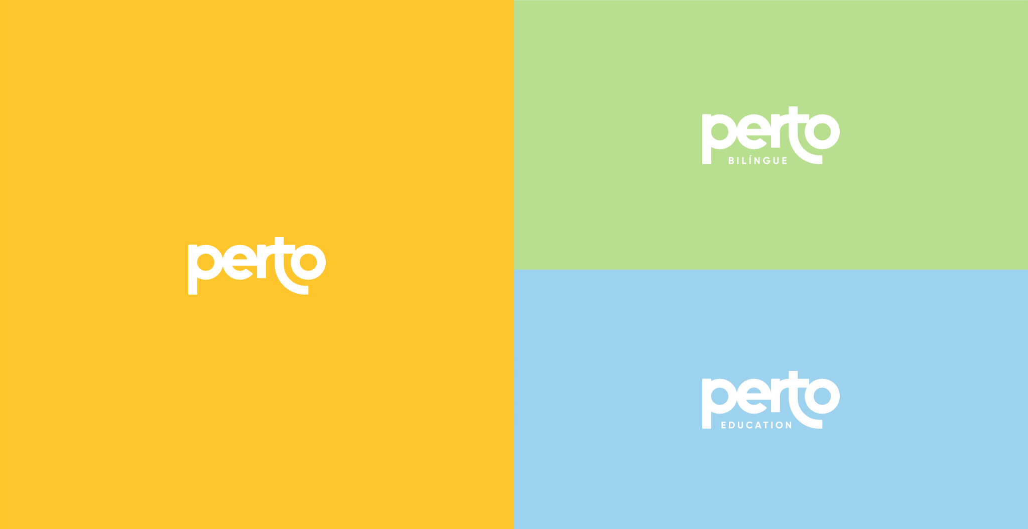
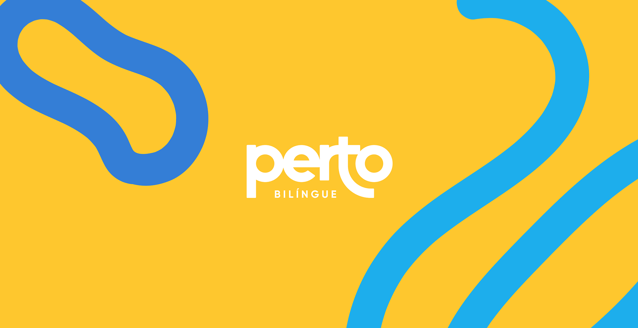
After several rounds of brainstorming and hundreds of domain searches, we conceived the name Perto Education. In Portuguese, this mild word means "near." A perfect solution to represent the intimacy & proximity that were always core values of the company. Just as in English, the word also means next, which combines perfectly with their inspiration to impact the next generation.
Perto education is a bilingual methodology company that introduces English in a playful and fun way in students’ daily routine.
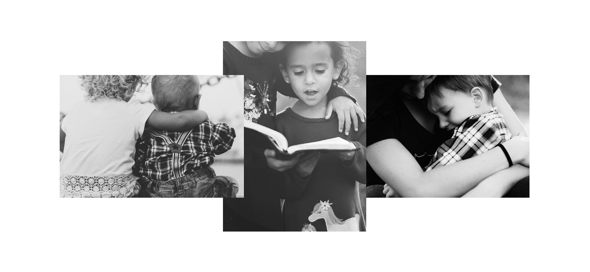
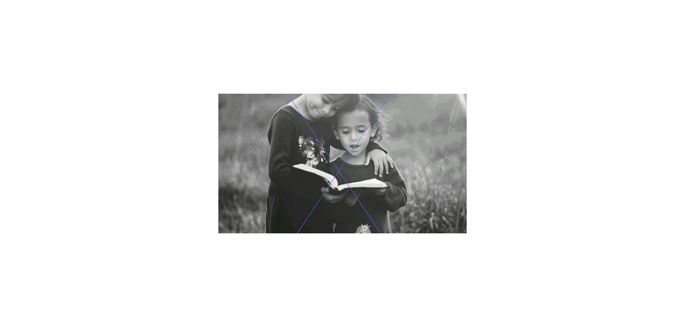
Designs explore affection and closeness in learning a new language. The identity is anchored with visual references of affection and warmth. This resulted in a geometric logotype, close letters and the letter T "embracing" the letter O.